
Revolut Business 5 for Treasury Products
Revolut Business 5 for Treasury Products
Revolut Business 5 for Treasury Products
Redesigning the UX to help business users
better grow their money
Redesigning the UX to help business users
better grow their money


Background
Following the Revolut 10 retail launch, Revolut Business aims to evolve from a brand refresh into a professional utility. I redesigned the Treasury suite to align with how enterprise users actually work on desktop.
Background
Following the Revolut 10 retail launch, Revolut Business aims to evolve from a brand refresh into a professional utility. I redesigned the Treasury suite to align with how enterprise users actually work on desktop.
Background
Following the Revolut 10 retail launch, Revolut Business aims to evolve from a brand refresh into a professional utility. I redesigned the Treasury suite to align with how enterprise users actually work on desktop.
Role
Product Designer for Treasury Tribe
Timeline
3 months (2024)
Team
1 Product Owner, 9 Engineers
Tools
Figma, Figjam
Before
Before
After
After
Business Problem
Scaling beyond “mobile-first”
Revolut Business’s web experience was a copy-paste of the app's “Hub”. While efficient for initial development, this scaled-up phone app failed to serve our most profitable segment, large enterprises (LE), in high-value actions like FX Forwards and Savings management.
User Pain
Efficiency tax
Unlike retail users, enterprise users tend to optimize the use of idle cash, and the old layout hid critical growth products such as Savings and FX behind multiple clicks.
80% of decision-makers expect paid accounts to be as intuitive as their personal retail app, but our web lacked the data density for high-stakes Treasury tasks.
86%
of LE decision-makers are exploring fintech solutions
64%
fear falling behind competitors without a digital switch
80%
expect same benefits in business accounts as in personal ones
86%
of LE decision-makers are exploring fintech solutions
64%
fear falling behind competitors without a digital switch
80%
expect same benefits in business accounts as in personal ones
86%
of LE decision-makers are exploring fintech solutions
64%
fear falling behind competitors without a digital switch
80%
expect same benefits in business accounts as in personal ones
“
How might we evolve a mobile-mirrored UI into a high-density web experience that empowers enterprise users?
How might we evolve a mobile-mirrored UI into a high-density web experience that empowers enterprise users?
Unified mental model
The real challenge here wasn't about visual; it was structural. In the legacy Revolut Business 4, there was no unified workflow for managing liquidity in Treasury. Savings and FX were separate tools hidden away in the "Hub". Users had to mentally connect these features themselves.
The consensus across the teams was to remove the Hub. This allowed us to surface Treasury as a top-level destination. However, this raised a new question: Does Treasury deserve its own “Home” like our Acquiring products?


①
Entry point
②
Savings
③
FX Forwards
④
FX Orders
①
Entry point
②
Savings
③
FX Forwards
④
FX Orders
Product switcher
To find the right home for Treasury, I looked at our Merchant products, a specialized line for merchant payment processing. Both Treasury and Acquiring are core-value verticals that require more depth than general banking features and own several sub-items underneath.
However, they differ in user behaviour. Treasury products are highly integrated into the daily liquidity management of the business.
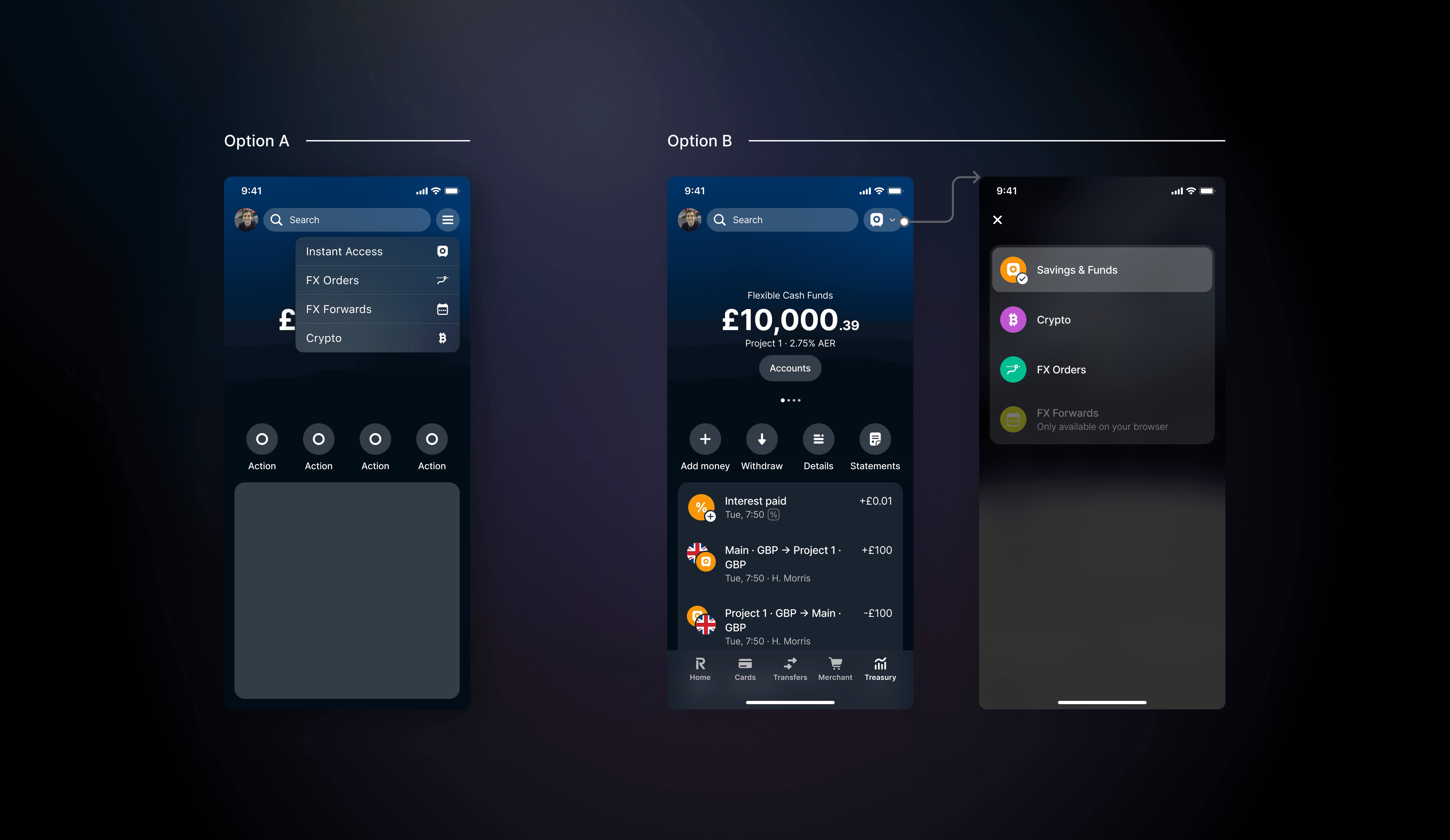

↑
I explored two paths to see which product switcher fits better for the current line, considering the future roadmap as shown above.
While a dedicated portal (Option A) like Merchant felt compact, enterprise users told us they valued speed over ceremony. By using the savings account as Treasury's default selection, we prioritized efficiency while pairing with the main banking experience of Accounts on the Home screen.
Redundancy vs. Value
To add up to the debate of whether to have a Home screen for Treasury, we made the decision focusing on strategic density and technical realities.
To avoid simply repeating data, I proposed a Contextual Assets Widget on the Home screen. This brought Savings and FX Forwards directly to the user’s front door, solving the unseen nature of Treasury without cluttering the UI, which could scale for future investment products.
External outcome
By moving Treasury from a hidden drawer to a core pillar, we reduced friction for our highest-value users, showing impact in both operational efficiency and profitability.
Operational efficiency: ~6.4% decrease in chat volume per new user, indicating the new UI was more self-explanatory and intuitive.
Business impact: Contributed to a £3M increase in GP through improved discoverability of FX Forwards and Savings products.
6.4%
decrease in customer support tickets per new user
£3M
increase in annual GP across Treasury products
6x
growth in quarterly Savings revenue within one year
6.4%
decrease in customer support tickets per new user
£3M
increase in annual GP across Treasury products
6x
growth in quarterly Savings revenue within one year
6.4%
decrease in customer support tickets per new user
£3M
increase in annual GP across Treasury products
6x
growth in quarterly Savings revenue within one year
Internal impact
This project helped build a stronger design culture within the tribe through transparency and open collaboration, significantly improving the relationship between design and engineering.
As a result, I achieved a 100% design happiness NPS, voted by the 16 core members, and was named Hero of the Quarter. This was a major step forward for design advocacy.

Key takeaways
Systemic consistency vs. user context: I learned to balance brand alignment with professional utility, knowing when to deviate from “retail” patterns to meet the high-density needs of a business user.
Cross-tribe diplomacy: I discovered that not all complex products require siloed portals like “Acquiring”; often, deep integration into the core banking flow provides a superior, high-speed UX.
Another story
Transforming manual contract creation into a high-confidence, automated digital workflow

Another story
Transforming manual contract creation into a high-confidence, automated digital workflow