mö
: a sustainable shopping app designed for exploring local shops and building authentic connections between shop owners and customers.
Role
Sole UX/UI designer of the concept case study
Scope
4 months, Oct 2020 - Jan 2021
Process
Research, Interviews, Survey, Competitive analysis, Ideation, Sketching, Prototyping, Testing, and Evaluation
Tools
Sketch, Figma, Miro, Usability Hub, Optimal Workshop, Paper & Pencil
FEATURE I
EXPLORE NEARBY SHOPS
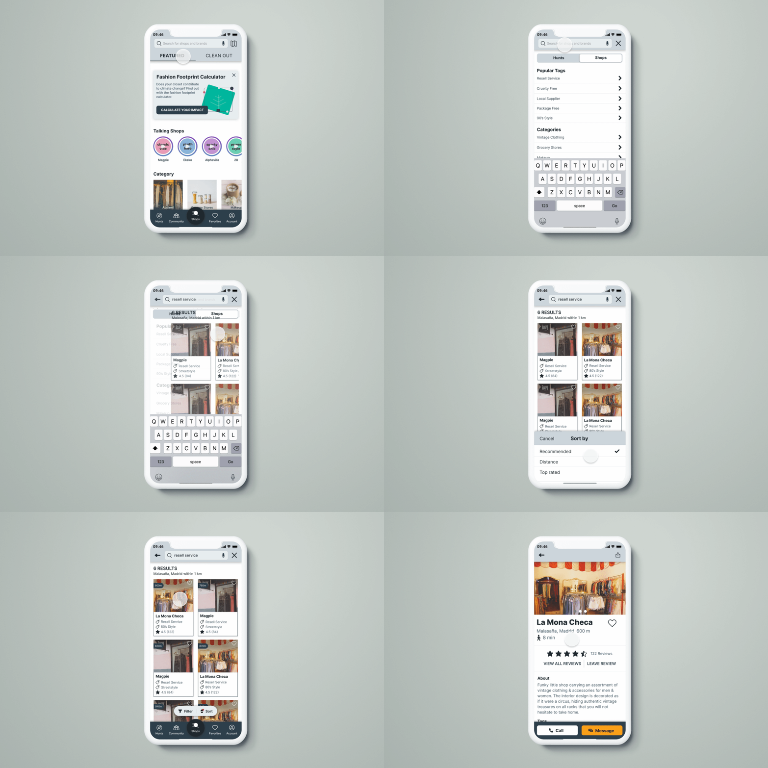
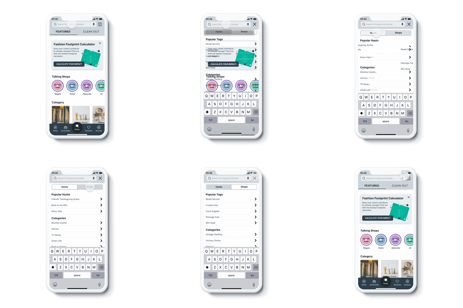
Users can find nearby sustainable and vintage shops based on their needs by tags using the universal search bar on top.
FEATURE II
DIRECT CHAT WITH A SHOP OWNER
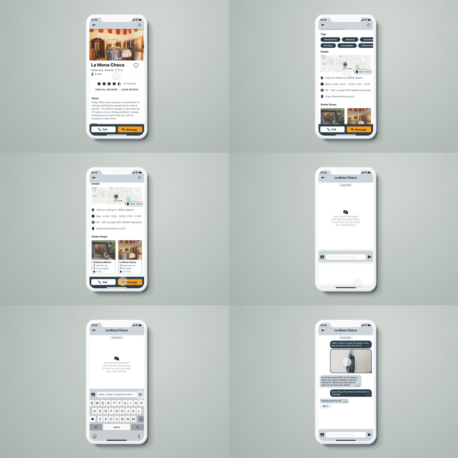
Users can use the messaging feature to communicate with shop owners on the topic of reselling their used clothes in details.
FEATURE III
EXPLORE WITH GAMIFIED EXPERIENCE
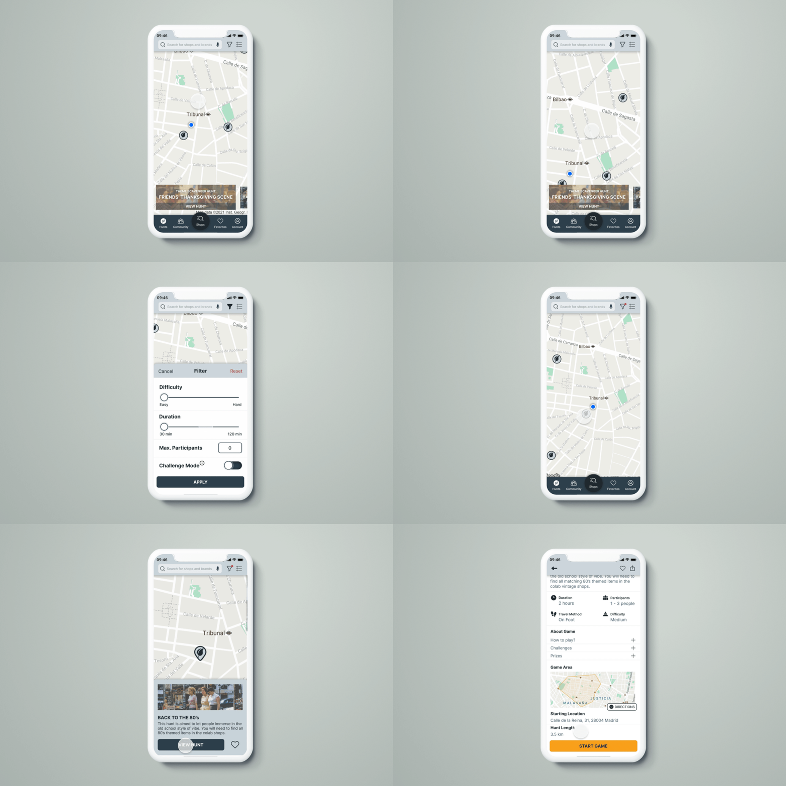
Users can participate in scavenger hunt activities with friends or solo as a new way to discover nearby sustainable and vintage shops.
FEATURE IV
RECEIVE COMMUNITY SUPPORT
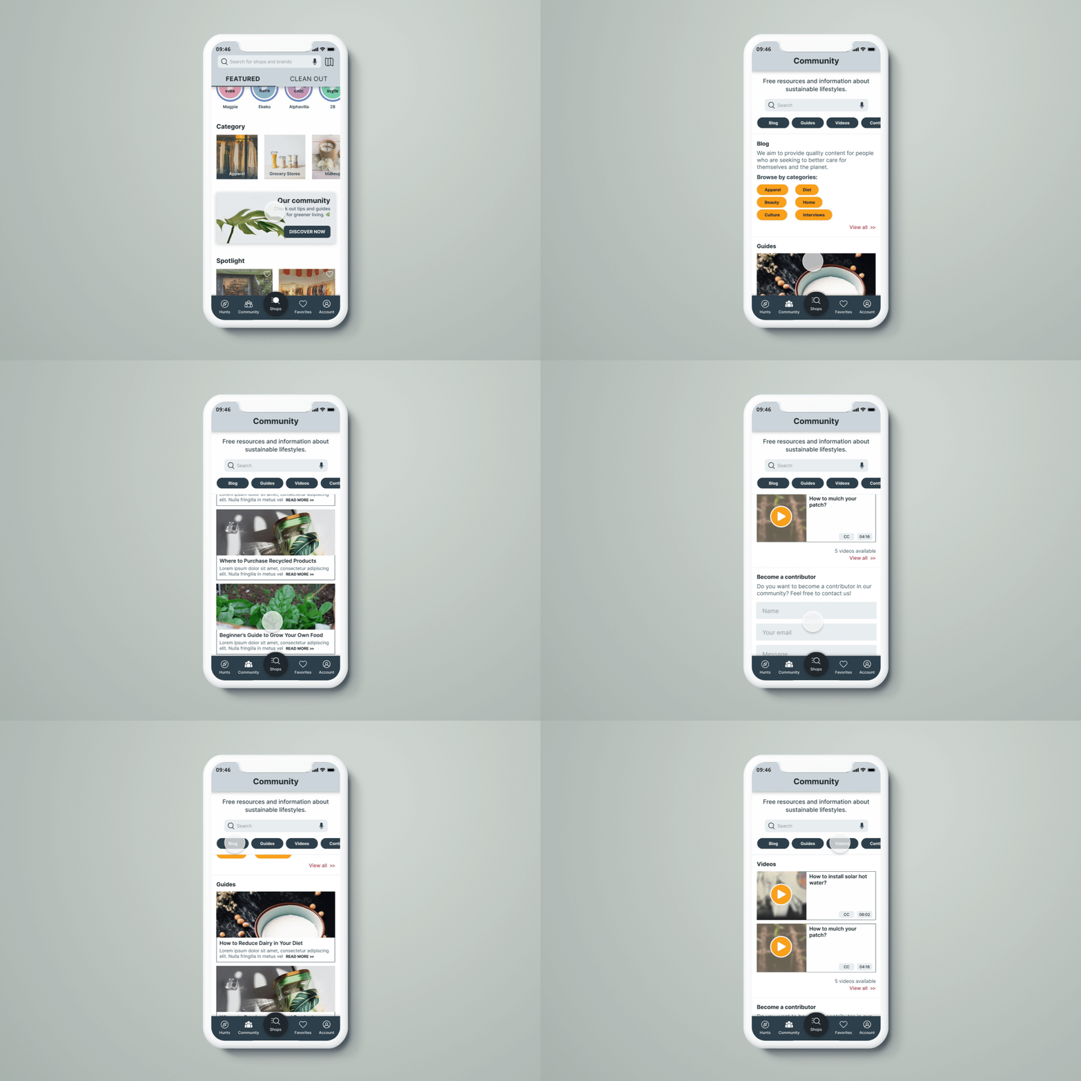
Users can get free resources and information about sustainable lifestyles based on different topics to reinforce their actions to apply in real life.
Up to what level do people put conscious shopping into practice?
When we talk about shopping mindfully, it’s inevitable to mention sustainable fashion and how it’s becoming more mainstream day by day. According to WWD, consumers spent more than seven billion hours online searching for “sustainable,” “ethical,” “fair trade,” and “eco-friendly” items in 2020. Regardless of it being the sub-consequence of COVID-19, it is true that more awareness has been brought to the subject of ‘shopping sustainably’.
However, do people really buy it?
Oeko-Tex Association, an ecological certification company, conducted a research study that found that while 60% of millennials said they are interested in certified clothing, only 37% had actually purchased any. Why is there a gap? Is sustainable living just a buzzword or people are having difficulty in interpreting the concept?
What is holding people back from shopping sustainably?
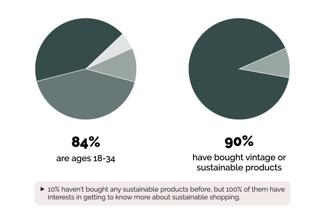
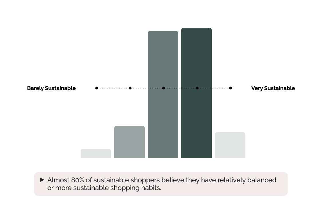
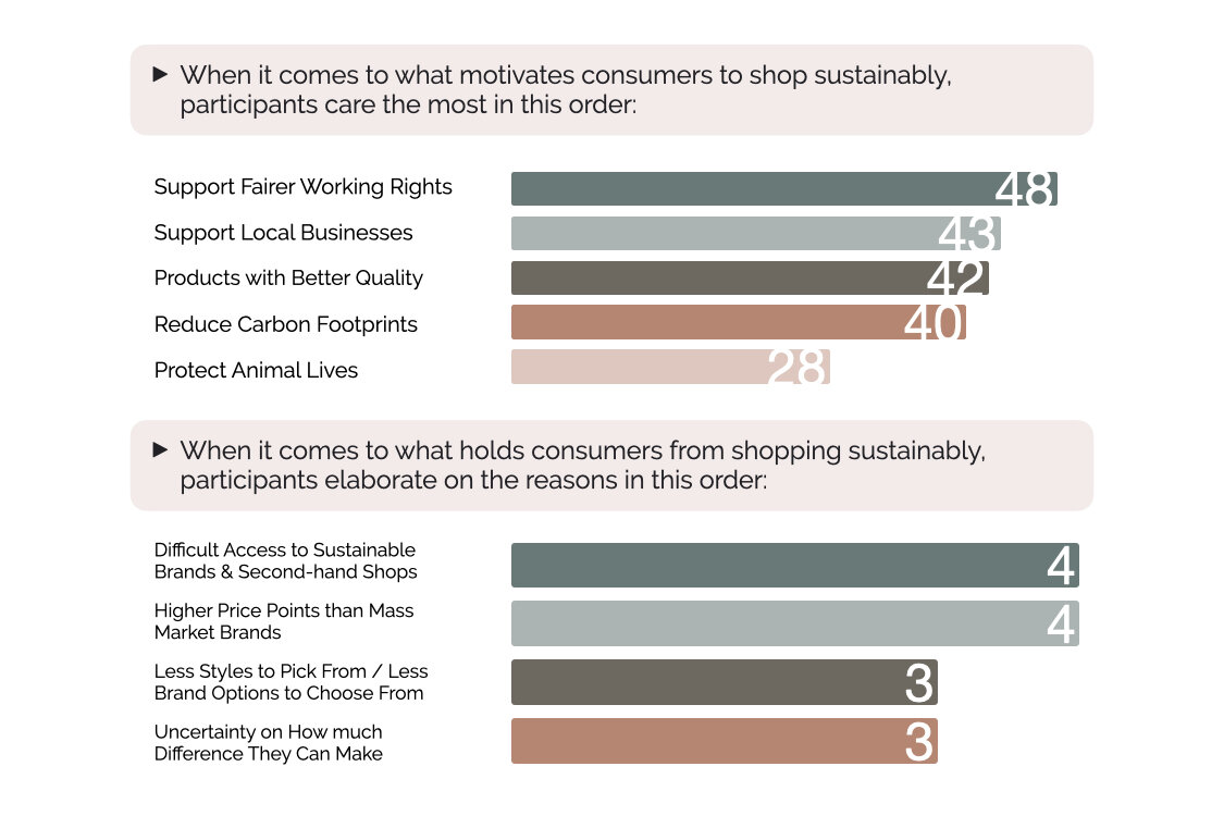
To better understand users’ general attitudes towards the concept of sustainable shopping, I put up a survey to get a bigger picture of what forms their motives to shop or not shop sustainably. This survey was targeting consumers who are interested in sustainable topics, with either strong or just fundamental knowledge. It was public for 24 hours and received 74 responses, here is the result:
Channels:
Reddit community - #Sustainable Fashion, #Ethical Fashion, #Sustainability, #Vintage Fashion, #Vintage
Facebook group - #The UX School, #Sustainable Fashion: eco-fashion, slow fashion, recycle, up-cycle
1. Concept Validation
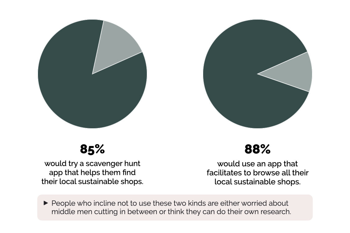
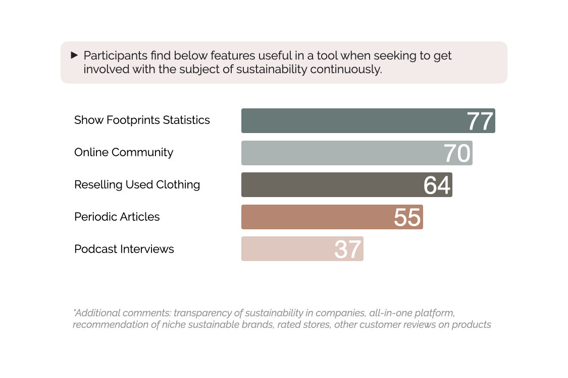
I began by conceptualising two joint ideas: a gamified shopping experience and a rating-based shopping map tailored for neighbourhoods. For this secondary research, I wanted to know if people would actually find value in these ideas and what they will find helpful to form their ways to shop sustainably. I took advantage of the previous survey I put out, and my key findings are below.
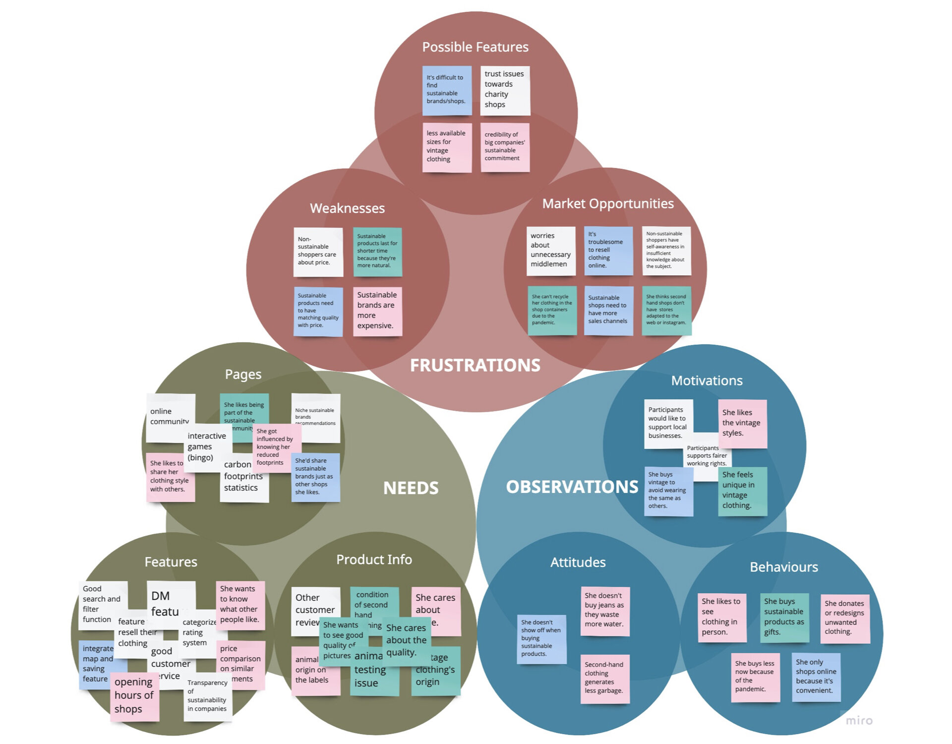
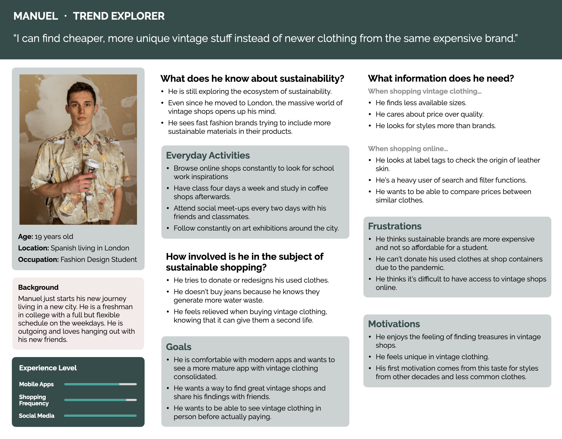
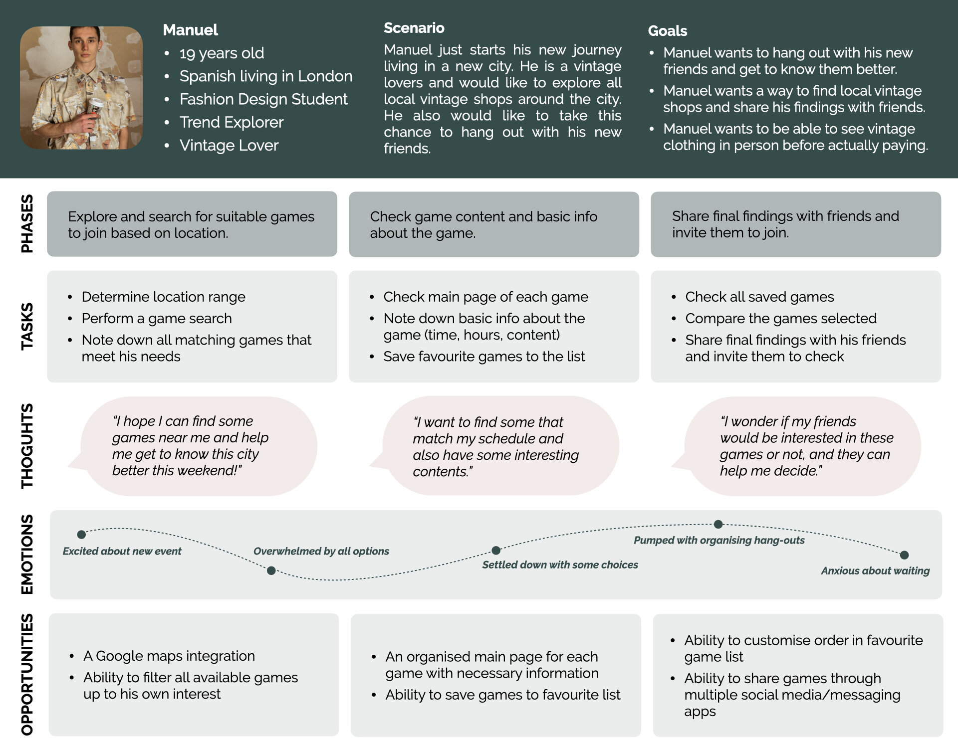
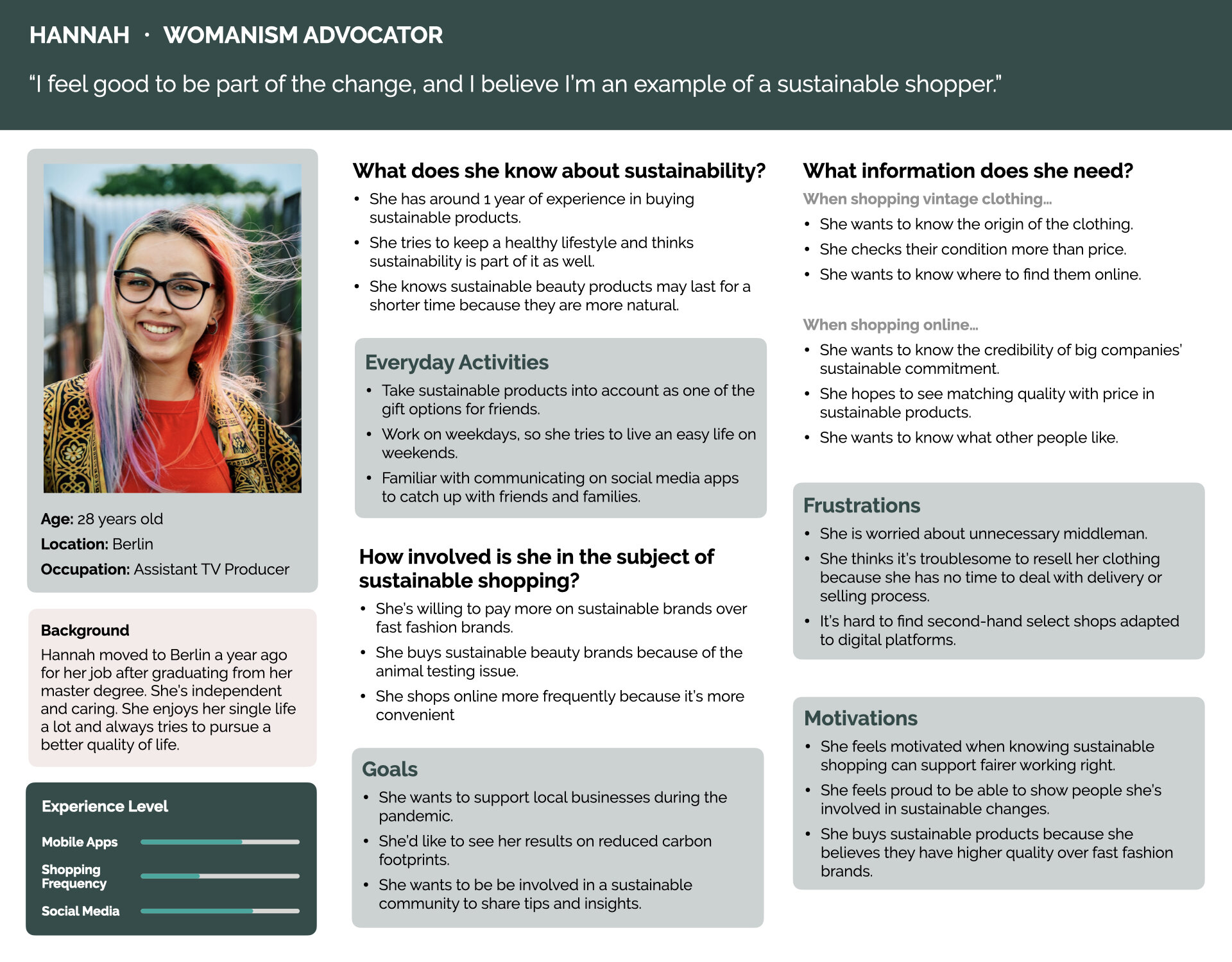
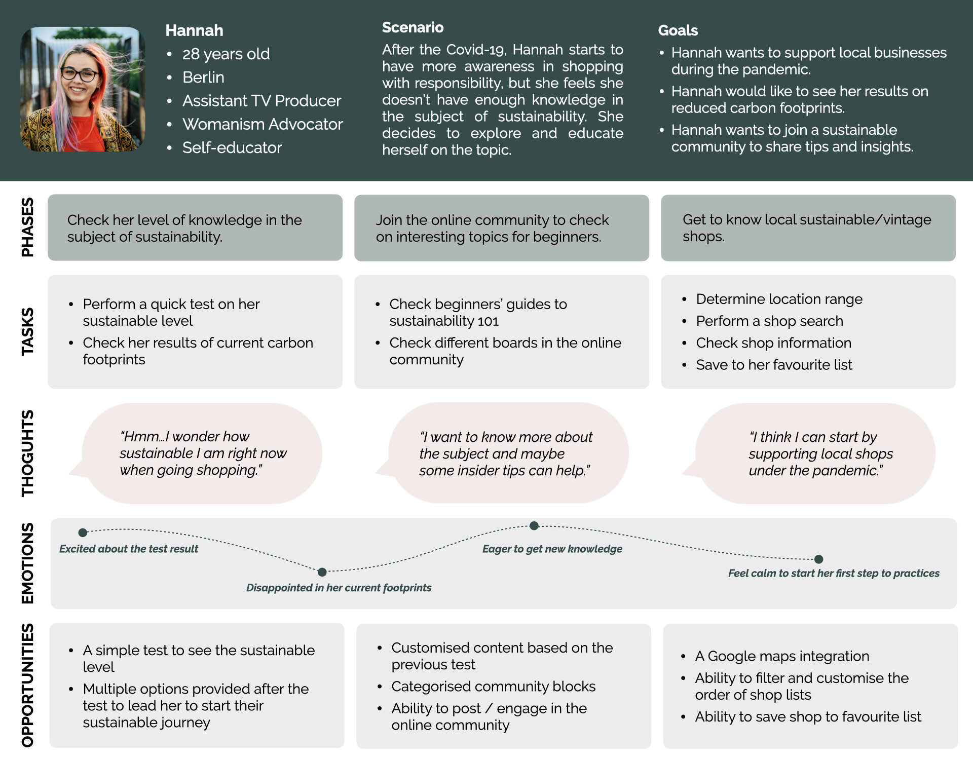
To identify challenges users encounter when trying to shop sustainably and to understand the fundamental reasons how users get motivated or demotivated, I recruited three participants with different levels of sustainable shopping habits (based on their self-assessment) to have in-depth interviews. I created an open affinity map to analyse the findings and two personas to immerse myself in the users’ mental model.
From this feedback, I decided to move forward with a digital app - a sustainable shopping platform with the following 3 main functions:
Vintage/Sustainable Shops Browser
Clean out: The survey and interviews made me realise many have the need to recycle or donate their used clothes, but not knowing where to start with or assuming that the process could be complicated, so I want to simplify the process and help them locate their closest secondhand shops within the browser.
Chats: Participants who have a certain awareness of the subject have concerns regarding the intervention of middlemen, therefore, I want to build a direct communication through the function of chats between shop owners and customers.
Footprint calculator: Throughout my competitive analysis, I discovered this Fashion Footprint Calculator designed by ThredUp. After validating “showing footprint statistics” is the top reason participants can be motivated to shop sustainably, I decided to integrate this questionnaire into the app by indicating the source.
Scavenger Hunt Activity
This feature was designed for Manuel, as my first persona, who has a relatively low level of sustainable shopping habits but show great interest in vintage clothing because of their styles. It’s an alternative way to introduce them to the sustainable world by developing their interests through gamified experience.
Community Support
”Online community” is the second-most popular reasons participants find useful when seeking to get involved with the subject of sustainability continuously, so my initial idea is to enable conversations between members within different forum boards as in Reddit.
2. IA & Low- to Mid-Fidelity Prototyping
Do people find the fundamental structure clear enough?
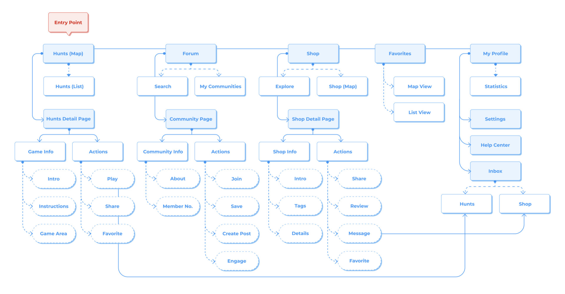
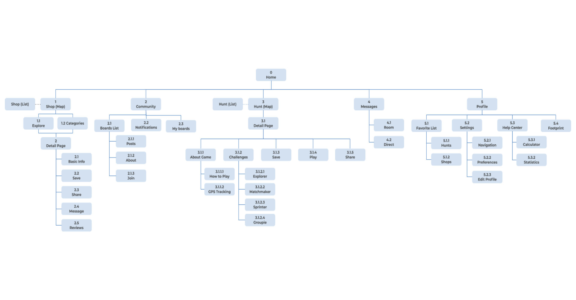
Before diving into designing the wireframes, I want to ensure the app structure is user-friendly enough, so I first created a draft version of sitemap and used it to conduct a closed online card sorting session with 10 users. With the card sorting results, I managed to refine my original sitemap and created the second and the third versions, to provide a more intuitive flow for users.
Sketches
3. High-fidelity Prototyping
Do the flows make sense? What’s missing?
For the third phase, I user-tested with 6 participants and also took the feedback I received from Careerfoundry’s online community to move toward my final version. Alongside iterating the features and flows, I worked on the overall UI design.
Versatile top search bar across pages
When testing the scenario of finding a shop that matches user needs, 5 out of 6 participants tried to use the Hunts’ search bar on top instead of navigating to the Shops page to use the search function there.
Home tabs with different purposes
・Users didn’t expect they could click on the “Browse by Tags” section, as 4 out of 6 participants skipped the “Browse by Tags” section on the Shops page.
・As a USP of the app, it is not clear enough for users to find shops with resell service on the Shops page, and the success rate of this task was only 25% overall.
Onboarding journey redesign
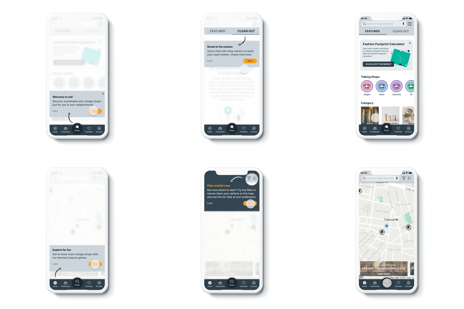
4 out of 6 participants said that they couldn’t resonate with the onboarding questionnaire intro, either they felt being thrown out with the content or they felt suspicious being asked questions about shopping habits too fast before actually using the app.
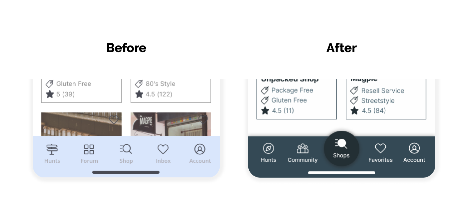
Bottom nav bar with a focus
Half of the participants were more interested in the Shops page because it can satisfy more of their needs in real life; while the game of scavenger hunts is a secondary/complementary need for them.
Visual Design & Branding
I aim to create a clean, open and familiar to use interface for the app. The visuals are meant to be calm-focused with a subtle touch of playfulness. For more details, check the design system here - moon for mö.
“möbius”
For the product name, I decided on "mö" from the term “möbius ring”, representing the spirit of an infinite sustainable circle. I also created a logo based on this concept.
What I’ve Learned
Design with a Purpose
At my early phase of drawing the wireframes, I put the feature of scavenger hunt as a priority in my project. Until I talked to one of the graduates by chance, he advised me to go beyond the project theme and think it through what really can bring values than just a portfolio project, but something I feel passionate about as well. Then I decided to put the feature of the hunt as a bonus feature and added the main feature of browsing local shops in my design.
Since I feel connected with my work and I understand the values behind it, this way of thinking helps me stand with firmer steps and broadens my horizon on how I can create not just a concept project.
Communication
During my research phase, I created a survey to make sure my problem statement is aligned with the real world, and I stepped out to ask strangers around on Reddit and Facebook to take it. I received generous feedback from more than 70 people, and I’m truly grateful for what they’ve contributed to my project. That’s when I realised the importance of talking to an accurate target audience than my personal network.
Where to Improve
Raise Up the Accessibility
The complexity of the app learnability is relatively high for users in the older generations, and considering most of them could fall under my target users as local shoppers, I’d like to make some improvements to higher up the accessibility to this group. Possible solutions would be adding an adjustable interface size, indicating interactivity on elements and creating animated tutorials over texts-based ones.
Optimise the Content based on Data
Ideally, the future user testing would be break into small sections with several short usability tests, such as first click tests and five second tests. On the other side, keeping track of the data with Google Analytics would be helpful to enable more A/B testing sessions to modify small changes.


